User Needs: An Easy, Effective Exercise To Get You Started

My name is Lars K Jensen, and I work with journalism, data and editorial insights as head of the Audience team at Berlingske Media in Denmark.
Feel free to connect on LinkedIn and say hi.
This article is a part of my series on user needs for publishers.
Recently, I've been talking and writing about our work with user needs in Berlingske Media – in particular my work with Berlingske, the 275 year old newspaper we are named after.
If you are an INMA member, there's a webinar you can watch, where I speak about user needs – together with Roy Wassink from DPG Media, who own Berlingske Media (yeah, small world 😉).
Some of the points from my presentation in the webinar even made it into the INMA report on newsroom transformation.
I have also written more in-depth about our work with implementing user needs earlier in this newsletter.
In this post, I don't want to talk about strategy or newsroom implementation – although, in a sense I do want to. Because I would like to share with you a really simple exercise I have been doing since I started working with user needs more than three years ago.
I have done it with small publishers, larger newspapers, local publishers and other kinds of organisations as well. And I believe it has helped with both communicating user needs as an approach and with the actual implementation.
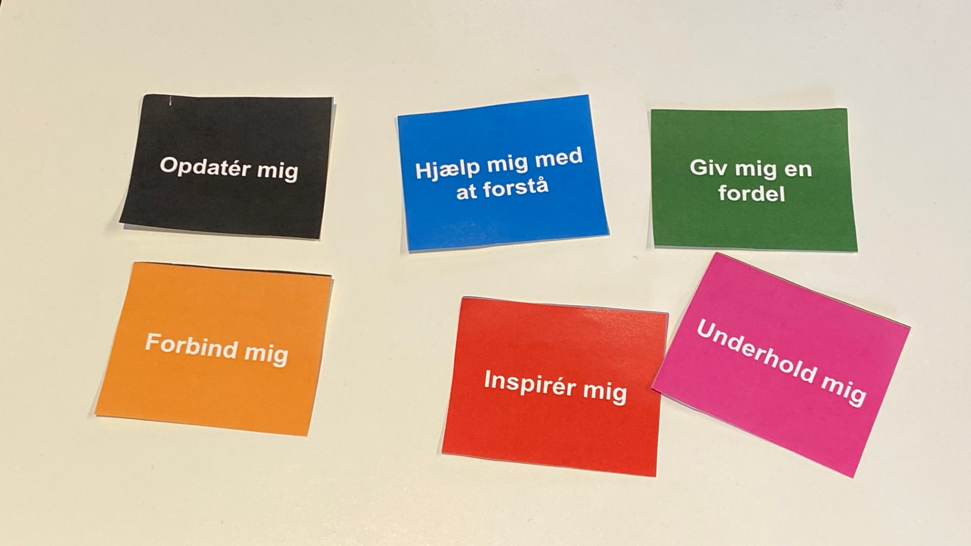
When I'm doing a presentation I talk about the exercise when I get to this slide:

Now, if you don't understand Danish, obviously a little translation is needed here. Basically, this is our translation of the user needs from the Wall Street Journal model:
- Opdatér mig: Update me
- Hjælp mig med at forstå: Help me understand
- Giv mig en fordel: Give me an edge (literally translates into "Give me an advantage")
- Forbind mig: Connect me (for us this is about people and connecting our audiences with them)
- Inspirér mig: Inspire me
- Underhold mig: Entertain me
And yes, I print out little cards or notes and hand out to the workshop participants – even though a lot of things are digital these days, tactileness still has a lot going for it in situations like this.
For the first iterations, I just told people a URL they had to go to with their phones (or showed them a QR code) and had built a simple web page where they could swipe through the different user needs. But I find the paper version works better.
Let's dive into it.